Date:
November 22, 2014
Empathy and Definition
Understanding the essence to chart the course
The graphic design project for G & A Audio began with the specific need to develop effective visual sales tools for both traditional and digital media. As a spin-off brand of the company GALEX, the project sought to capitalize on the already established logistical infrastructure and reputation of this company dedicated to the marketing of entertainment centers and arcade machines. G & A Audio’s objective was to distribute new audio equipment, mainly amplified baffles of different powers and bounces, through GALEX’s points of presence throughout the country. This approach involved building attractive and functional visual material in two key formats: half-letter size print for direct sales and 1080×1080 pixel square publications for social networks, especially Facebook.
To better understand the competitive context and the expectations of the target audience, a benchmark analysis was performed in which advertising pieces of similar companies were studied, current visual trends in the professional audio market were identified and the main technical elements that other brands highlighted were reviewed. This allowed to find patterns and styles that aligned with the intention of the brand, while helping to define which colorimetries were saturated and which could serve to position differentiated G & A Audio products. Thanks to this process, key insights were obtained to identify the most relevant technical attributes by type of equipment, allowing to establish an efficient content structure for each piece.
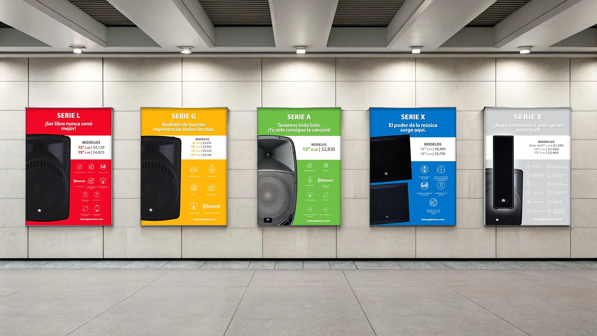
The main challenge was to select and organize the information in a way that was clear, concise and attractive to the end consumer. It was necessary to define which technical specifications really added value and which could be omitted without affecting the purchase decision. From there, a visual differentiation system was proposed that would assign a specific chromatic palette to each equipment model, facilitating its classification from standard to premium level. This strategic visual approach not only improved the legibility of the material, but also made it possible to establish a clear hierarchy among the products offered, raising the brand’s perception of professionalism.
Advertising design
Visual communication to stand out
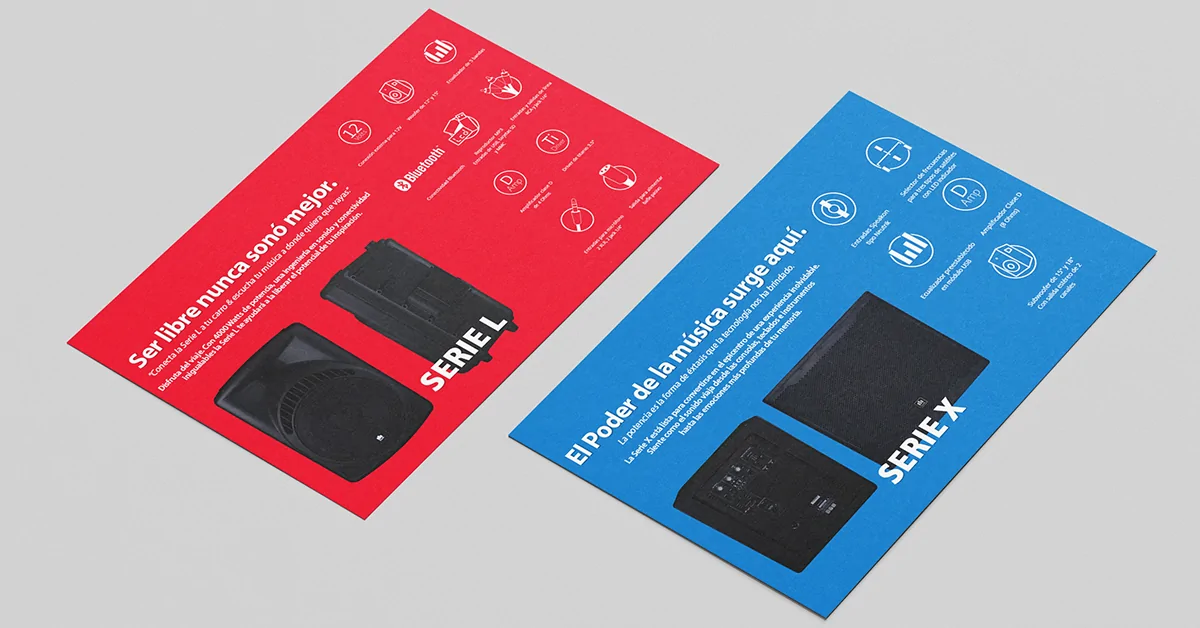
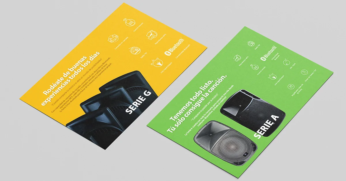
Advertising material was developed in two key formats: half letter for print and square publications for social networks. Each piece of equipment, from amplified speakers to high power baffles, was represented with a clear, attractive and technical design, highlighting relevant specifications. A color palette differentiated by model was used to facilitate identification and reinforce the visual impact of the brand.
Ideation and Prototyping
Shaping ideas and creating tangible solutions
The creative process was approached with a solid base, since G & A Audio had a previously developed corporate identity. This allowed to focus the creative energy on the efficient application of this identity in different formats. Since the parent company, GALEX, is related to entertainment, it was decided that the overall aesthetics should convey dynamism, accessibility and energy. With this in mind, bright colors were selected to evoke the playful nature of the brand, while serving as visual codes to distinguish each type of product. The first step was the design of informative flyers in half letter format for printing, where a clear visual structure was established that could be replicated for the entire line of equipment. The choice of color for each product was strategic and responded to both its level within the portfolio and its functionality.
A basic layout was built to facilitate the reading of the most relevant technical specifications, visually organizing the data according to their importance. The composition included title, equipment image, general description, and a highlighted section for key attributes, all arranged hierarchically and coherently with the visual identity. After the designs were completed, tests were conducted on digital mockups as well as printed versions to evaluate the visual performance of the materials in real-life usage situations. The pieces were also adapted to square digital publications, prioritizing the visibility of the product image and the most striking specifications in the social media format.
Customer feedback was positive from the first presentations, although adjustments were made to the wording of some texts to improve the clarity of the message. Certain visual elements were also refined as we progressed in the creation of materials for new products, especially in relation to higher power speakers and premium models, which required highlighting more specific features. This ability to adapt and refine was key to consolidating a series of visual pieces that were versatile, consistent and aligned with G & A Audio’s business objectives. The end result was a visual sales tool that not only facilitated the promotion of the products, but also reinforced the brand identity within a highly competitive market.