Date:
February 27, 2023
Empathy and Definition
Understanding the essence to chart the course
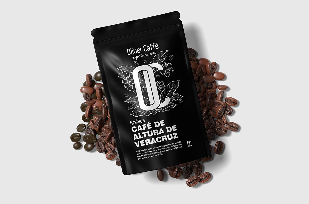
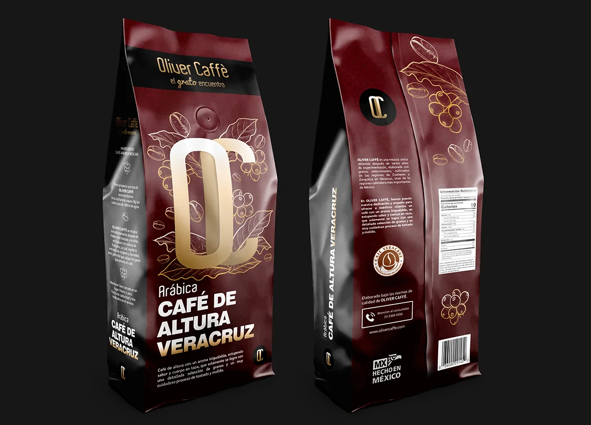
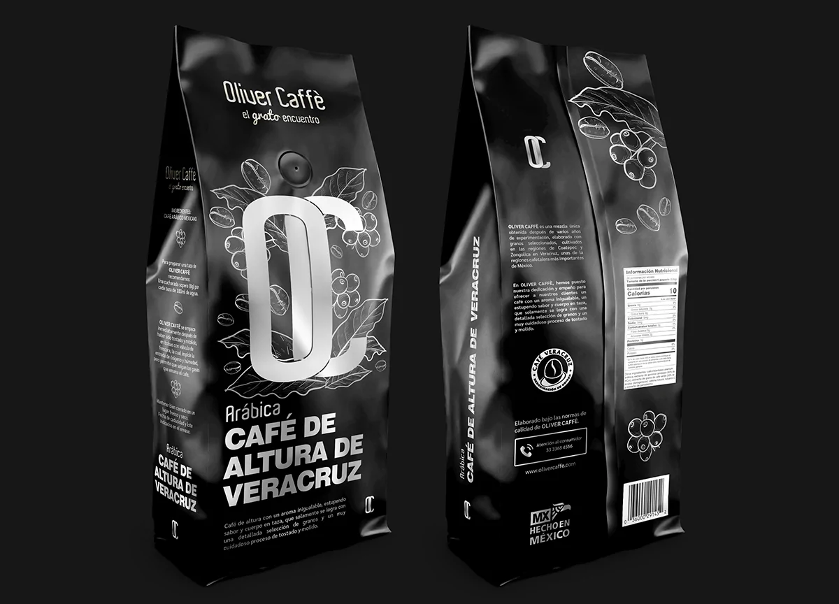
Oliver Caffè was looking to strengthen its corporate identity and renew the packaging design of its specialty coffee, a Mexican high altitude Arabica grown in the renowned coffee growing regions of Coatepec and Zongolica, Veracruz. Its objective was to communicate, through design, the exceptional quality of its product and its commitment to artisanal roasting and unparalleled freshness.
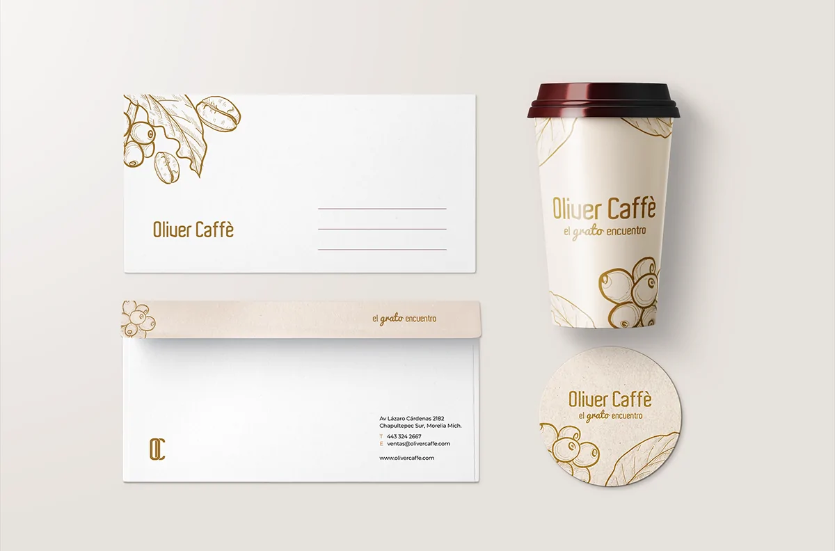
In addition, to update the prices and products of its restaurant-bar menu, while improving its corporate image. The priority was to develop an elegant and premium design for the coffee packaging in 500g and 250g presentations, with trilaminate bags with freshness valve, and in pouch packaging. Also required was a consistent application of the brand on thermal cups, cup holders and stationery.
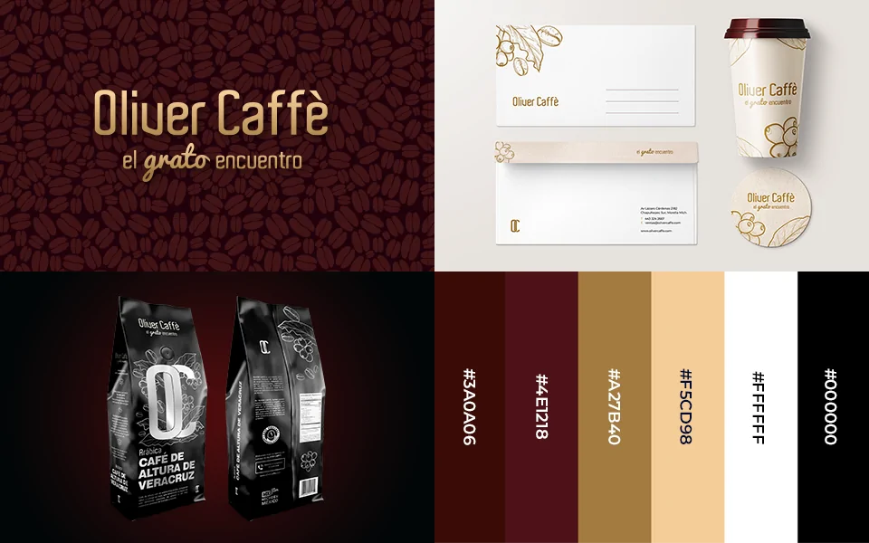
A visual benchmarking of national and international brands of high altitude coffee was carried out. From this observation we selected styles, colors and graphic structures that communicate sophistication, naturalness and authenticity. This phase was key to build a differentiated and coherent visual identity with the target market.
The challenge was technical and conceptual: defining the most suitable materials, choosing between packaging options, optimizing printing costs by using a single ink and adapting the designs to real industrial production templates. All this without losing visual strength or brand impact.
Premium identity for a premium taste
From Veracruz soil to packaging: a refined brand for an authentic product
For Oliver Caffè we developed a sober and elegant visual identity that highlights the quality of its Veracruz coffee. The main solution was a packaging redesign in a single ink, which reduced costs and elevated the premium character of the product. It was also implemented in cups, cup holders and stationery, consolidating a coherent and differentiated brand.
Ideation and Prototyping
Shaping ideas and creating tangible solutions
The creative process began with a detailed analysis of the original layout, typographies used and content structure. This allowed us to establish the basis of the visual system already implemented. From there, proposals were generated to accommodate the new information, adjusting cells, rows and hierarchies without altering the essence of the design. Special attention was paid to the harmonious integration of complementary typographies and reorganization of elements to improve the use of space.
The solutions proposed revolved around functionality and visual coherence: adapting the new information within the same grid, updating sections and optimizing the category structure without sacrificing clarity. The prototypes were developed in digital format, simulating the final presentation in triptychs or table menus. Although physical testing was not possible due to the remote collaboration between countries, maximum fidelity to the original design was sought. Adjustments were minimal, focused on specific text corrections and final validation with the price sheet. The result was a smooth, unobtrusive and fully integrated update to the pre-existing visual system.