Date:
November 27, 2015
Empathy and Definition
Understanding the essence to chart the course
The visual identity project for Chemical Clean began with a deep analysis stage focused on understanding both the history and the current objectives of the client. The brand was looking to renew its logo without losing the elements that made it recognizable, mainly its original typography. In addition, they wanted to incorporate a new chromatic range -from green to yellow- that for them represented their values and industrial segments. The objective went beyond the graphic redesign: they needed a strategic visual tool that would communicate solidity, specialization and order within their offer of chemical products for industrial cleaning.
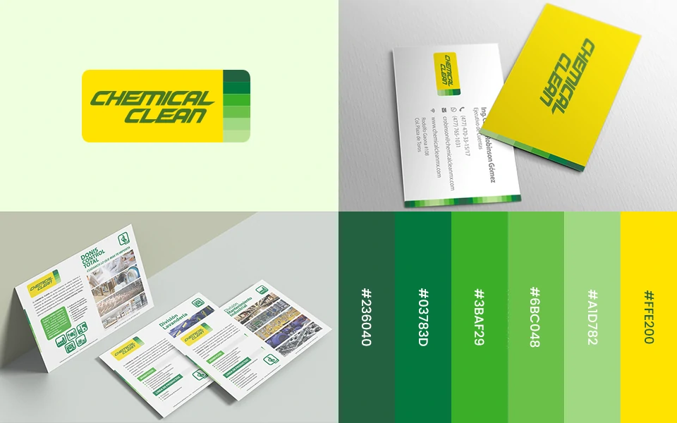
Through work sessions and the exchange of ideas with the client, we detected the need to generate a more structured visual identity that would clearly communicate the products of each division. Based on this, a benchmark analysis of brands in the same sector was carried out, focusing on how they graphically resolved the communication to different types of industries. This research led to the proposal of a visual system based on color codes by division, which would facilitate the understanding of the product catalog.
For the redesign of the logo, we also took information contained in their sales material, as well as key elements of their corporate philosophy. All this allowed us to define the real challenge of the project: to integrate the client’s ideas and aspirations into a coherent, adaptable and functional visual identity. This work was key to lay the foundations of the corporate identity manual and ensure its correct application in print, digital media and sales materials. Additionally, time was spent finding stock images that effectively represented each industry, as individual photo shoots would have been costly. This approach allowed us to build a unified, technical and direct visual language, ideal for a specialized company like Chemical Clean.
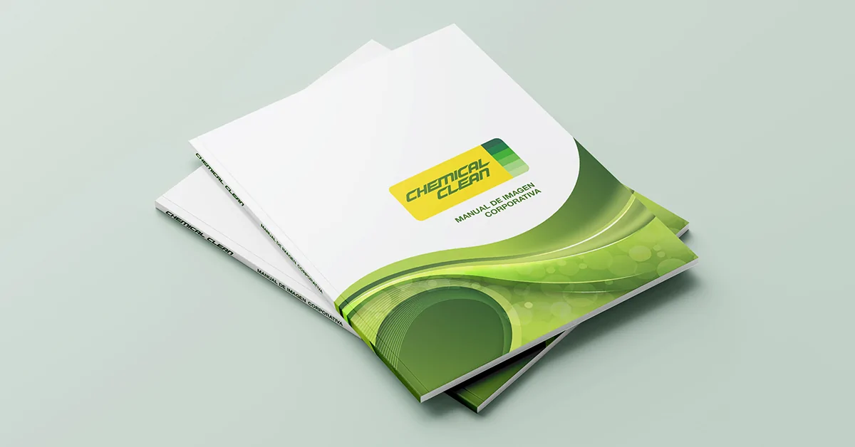
Visual redesign
Renewed identity to communicate cleanliness and specialization.
The challenge was to redesign Chemical Clean’s visual identity without losing the essential elements that its founder valued, such as the original typography. Based on a strategic and aesthetic analysis, we developed a chromatic identity that clearly communicates the different industrial divisions of the company. The result was an adaptable logo, a palette segmented by industry and a functional identity manual that ensures consistency across all its touch points.
Ideation and Prototyping
Shaping ideas and creating tangible solutions
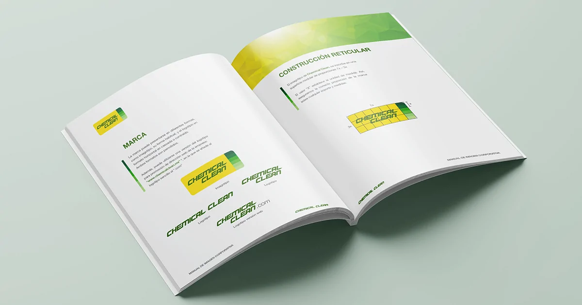
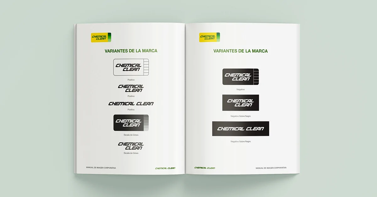
With the strategic foundation clear, the creative development of the visual identity began. The process began with sketching sessions focused on maintaining the essence of the previous logo while integrating the new color elements. The range of greens and yellows should not only be present as a decorative resource, but should also be functional for the brand’s communication structure. Therefore, a system was designed where each color represents an industrial division, functioning as a kind of “visual tag” to identify product families.
The generation of ideas was supported by moodboards and typographic tests, seeking to achieve a balance between the technical and the clean. The solutions explored focused on how to visually show that Chemical Clean is a company with specialized solutions, without saturating elements or falling into visual clichés of the sector. The typography of the original logo was rescued and optimized, which allowed us to maintain continuity without losing modernity.
The initial prototype included mockups of promotional pieces, data sheets and other printed materials in half-letter format. These pieces were intended as sales tools for different industries, and were shown both in digital format and in real prints to validate their functionality. The client showed a high level of satisfaction with the proposal. The identity manual was delivered in PDF and served as a key guide to maintain visual consistency in future applications.
The adjustments made focused mainly on the selection of images for each division, refining the visual representation according to the client’s vision. Minor text changes were also made to improve the clarity of the message. Thanks to the orderly process and constant monitoring, Chemical Clean’s new identity achieved its goal: to project a more professional, adaptable image, aligned with the specialization of its products.