Date:
July 2, 2018
Research and Discovery
Project objective:
The main objective was to redesign Biocheck’s mobile application with a more attractive and modern visual approach. A clean and professional interface was sought, without altering the existing navigation structure. In addition, it had to ensure optimal synchronization between the biometric time clocks, the app and the administrative platform for PC.
Customer History
BioCheck (biocheck.net) is a Mexican company dedicated to offering attendance control and human resources management solutions using biometric technology. It has a digital platform and physical devices such as time clocks with facial and fingerprint recognition. Its system allows to control shifts, generate reports and manage personnel in a centralized way for multiple branches.
What does the platform do?
- Real Time Attendance Registration (fingerprint, face, or mobile app)
- Shift and Workday Management (flexible, rotating, night shifts)
- Vacations and Leaves (authorizations, excused absences)
- Customizable Reports (Excel/PDF, with automatic alerts)
- Integration with Biometric Watches (A, C, E Series)
- Multi-Branch and Multi-User Support
- Legal Compliance (with Mexican Federal Labor Law)
Target audience:
The end users are the employees of the companies that purchase the Biocheck system. They use the app to record their attendance, mainly in the field or on commercial routes, through facial recognition and geolocation. The app allows validating that a worker was present at the scheduled location in a timely manner, by checking in and out during their assigned route.
Research methods used:
- Competitive analysis
- End-user behavior study
- Evaluation of the technical conditions for facial enlistment
Key findings:
- Main problem: Facial registration required five photographs under specific conditions (good light, clean background), which complicated the initial enrollment.
- Outstanding opportunity: To pioneer biometric attendance registration by app in the Mexican labor context.
- Key Insight: Users are increasingly familiar with secure mobile platforms, which facilitates the adoption of time and attendance technology solutions.
Architecture & Strategy
Content structure and user flows
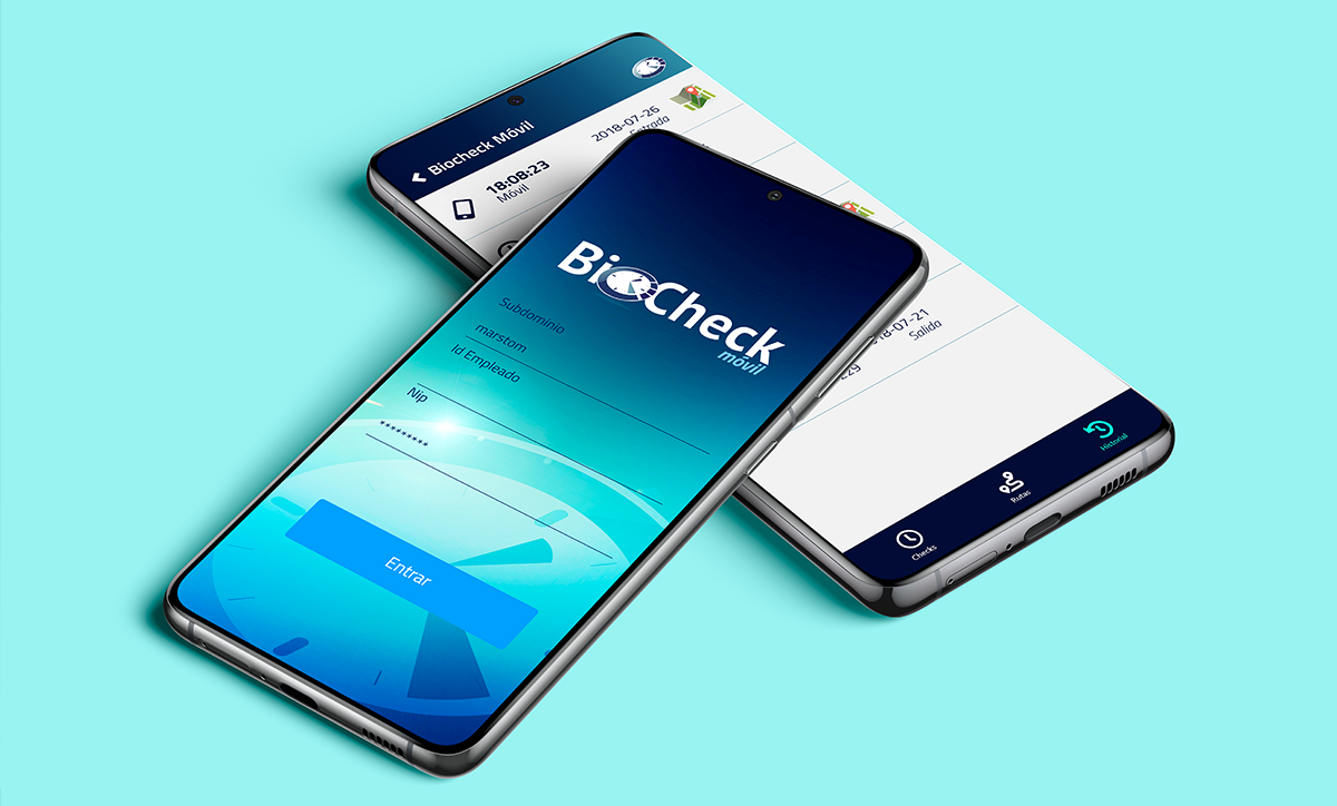
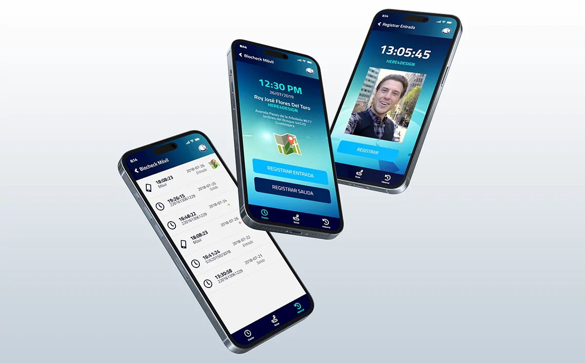
Navigation was kept simple and straightforward. The app consists of three sections accessible from a bottom menu:
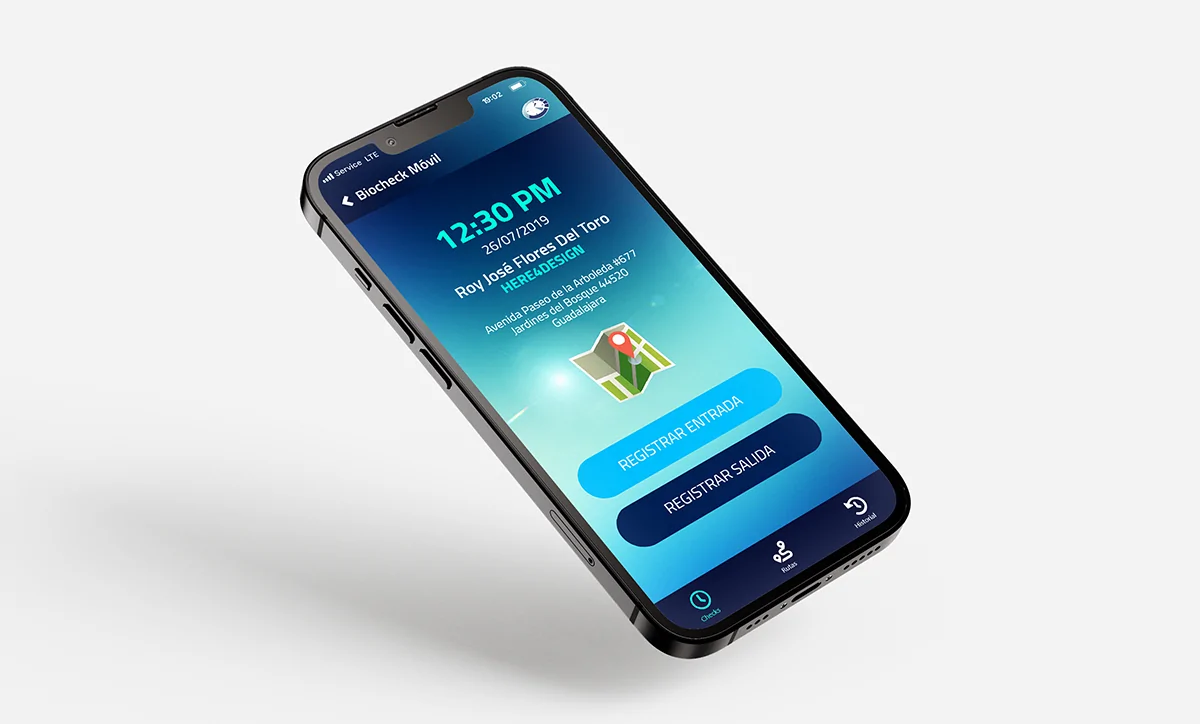
- Check: Entry/exit registration with biometric data.
- Routes: List of assigned places to visit, with shortcuts to Google Maps.
- History: Chronological display of previous records (app or watch).
Wireframes and initial approach
From the beginning, wireframes were designed with a linear flow, eliminating the need for drop-down menus. Each main action has its own dedicated view. These sketches allowed us to work hand in hand with the programmers from the early stages.
Subsequently, the final mockups were delivered with visual design, palette, iconography, and all the necessary assets for implementation.
Reasoning behind key decisions
- Lower menu: Chosen for its speed and clarity, avoiding unnecessary steps to reach the main functions.
- Intuitive flow: A directional logic (right: forward, left: backward) was respected to maintain visual coherence and usability.
- Biometric enrollment: A wizard was designed to guide the user in the correct taking of 5 photos to generate the facial map.
Functional details by section
- CHECK: Allows the user to check-in or check-out, as long as he/she has previously completed the facial enrollment (5 photos).
- ROUTES: List of assigned visits with icon to open the address in map apps.
- HISTORY: Displays records sorted by date, time, device type and check type.
Information hierarchy
- Titles and subtitles centered for easy reading.
- The body of the content also centered, clear visual hierarchy with defined sizes.
- Buttons and elements well spaced to avoid visual overload.
UX/UI Redesign
A more agile, clearer and user-centric experience
BioCheck’s UX/UI project focused on transforming a technical tool into an accessible, visually intuitive platform aligned with corporate wellness objectives. Navigation was optimized, key information was prioritized for decision makers and clear and understandable data visualizations were designed. The result: a modern and functional interface that improves the interpretation of results, facilitates the monitoring of organizational health indicators and reinforces the credibility of the service with managers and human talent areas.
Visual Design & Prototyping
Moodboard and visual management
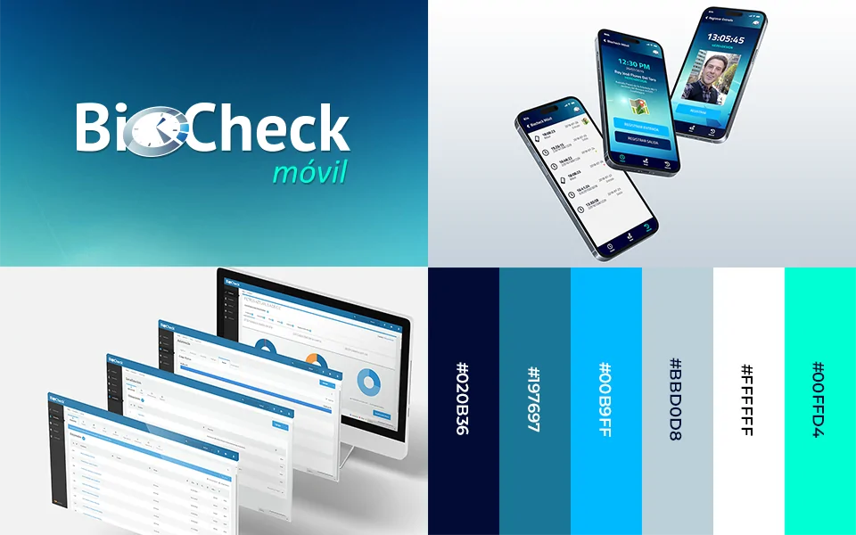
Color palette:
- Corporate blue, black and white as a base
- Bright turquoise green as an accent.
- Yellow and red for alerts and status.
Typography:
- Titillium Web (400, 600 and 800) for its readability and aesthetics, suggested as a standard for the app.
General visual style:
- Modern, attractive and clean visuals.
- The use of cards was avoided to keep the interface light and straightforward.
- Renewed iconography, with focus on clear functionality.
Main UI components
- Use of React Native and its integrated component system.
- Primary and secondary color palettes were defined for visual uniformity.
- Full width inputs with bottom line design, ideal for login.
- Specific lists for Routes and for History:
- Routes: Map icon + name and address of the place.
- History: Log type icons + time + date + device used + geolocation (if applicable).
Interactive prototype
The prototype was developed in Adobe XD, leveraging an existing library based on React Native. Interactions between screens were mapped and a functional link was shared with the Megacable team for internal testing.
Testing and Iteration
Tests performed
- Functional testing with internal customer users.
- Facial roll-up test under different light conditions.
- Synchronization tests with the management system and physical devices.
Feedback and improvements implemented
- Visual onboarding was adjusted to improve the photo-taking process at enrollment.
- Visual improvements were made to the history to highlight the difference between records per watch and per app.
- Colors were adjusted to ensure sufficient contrast outdoors or in low light.
Results and Conclusions
The redesign of the Biocheck app greatly improved the visual perception and user experience, making it easier to use for field workers. The app maintains a simple functional logic, while conveying technological confidence. Adoption increased, especially among companies with rotating or distributed staff.
In addition, the visual and structural foundations were laid for future versions, with a scalable system that can be adapted as Biocheck’s functionalities evolve.
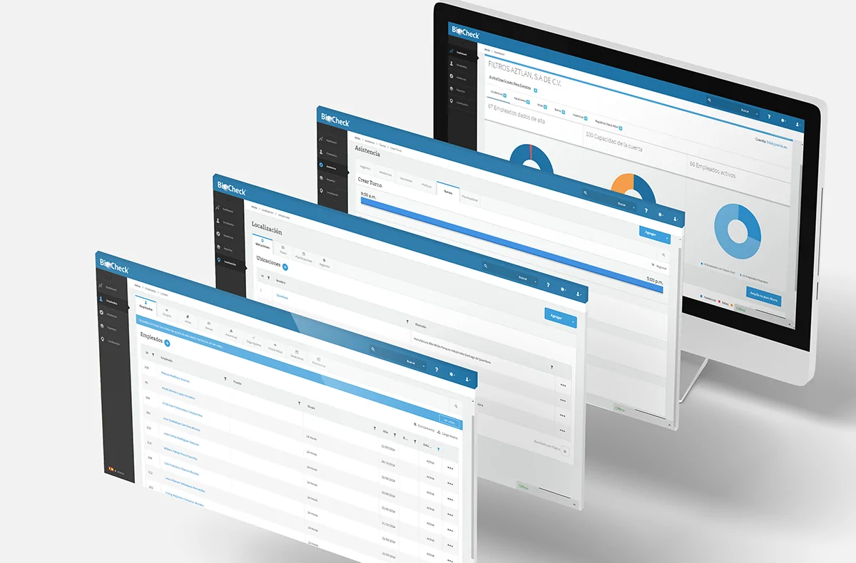
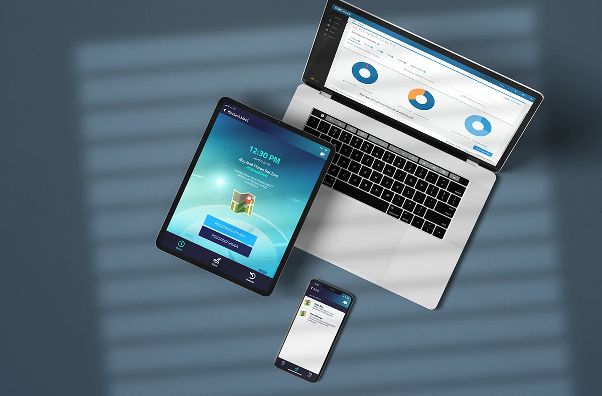
Extra step: Administrative system
During the design of the administrative system and the app, specific tools were developed together to centralize the control of attendance, vacations, shifts and reports, all with the aim of making it easier for the administrator to manage his staff. Each module was custom-made: from the interface for assigning shifts to the logic for managing incidents by branch.
Everything was conceived as a modular and scalable ecosystem, which connects naturally with biometric devices and allows multiple sites to be operated from a single panel. Even permissions management, automatic alerts and downloadable reports were integrated with a focus on clarity, speed and regulatory compliance.