Date:
October 28, 2018
Empathy and Definition
Understanding the essence to chart the course
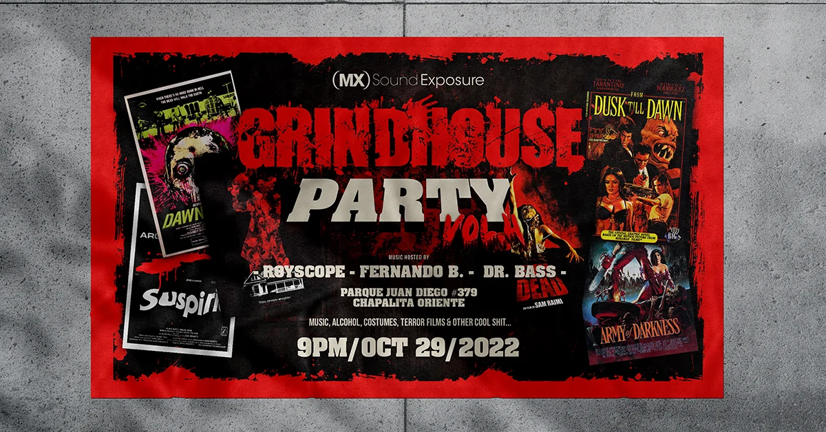
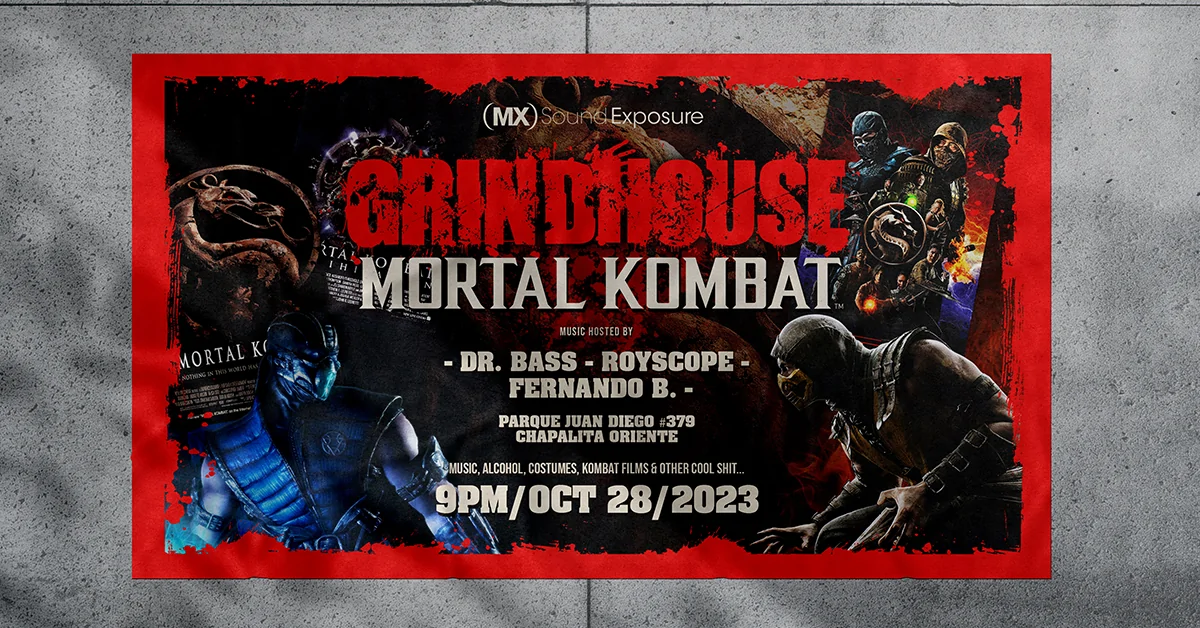
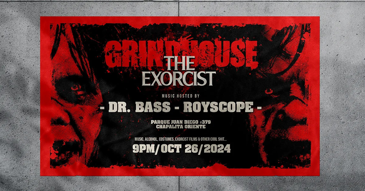
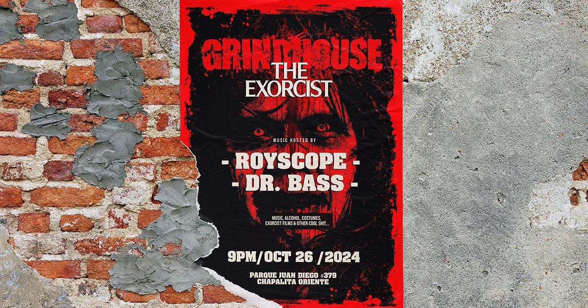
Grindhouse is an annual electronic music party held on the eve of Halloween, combining costumes, live DJ sets and horror film screenings. The client was looking to update and professionalize its visual and digital presence, focusing on the creation of promotional material for social media, print and audiovisual.
The main need was to design an adaptable graphic line that would respect the grindhouse spirit: retro aesthetics, B-movie inspiration, and a visual language that would evoke the continuous projections of films in a deteriorated or worn-out format.
The analysis started with a local benchmark, studying Halloween parties in Guadalajara and similar visual styles. The challenge was to create a flexible graphic system that could be adapted each year to the specific theme of the event, while maintaining aesthetic coherence and a strong and recognizable identity. Technical aspects such as eighties typography, pop culture elements and direct visual references to movies shown in each edition were considered.
Modular design
A versatile layout that evolves with each edition.
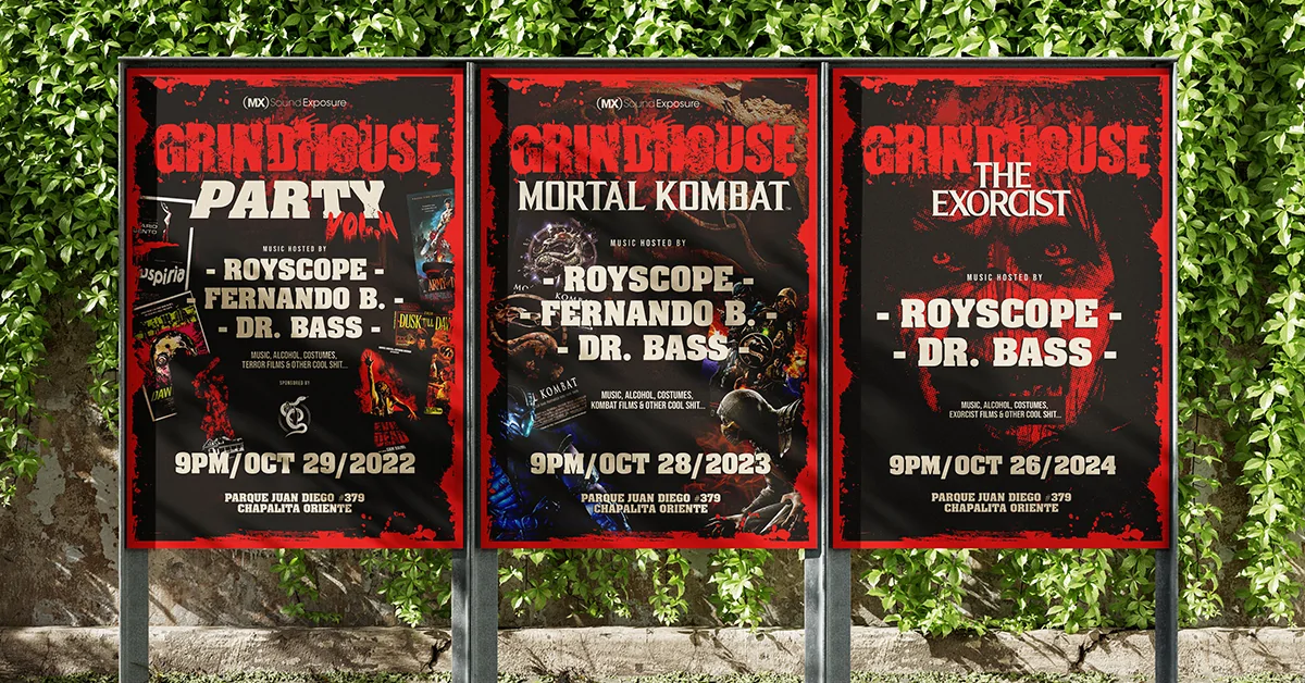
The great challenge was to develop a graphic system that would maintain a consistent visual identity from year to year, but at the same time could be nurtured by the particular theme of each edition of Grindhouse Party’s. The layout created works as a modular base: it preserves the aesthetics of B horror films and allows the insertion of new visual elements, film titles, colors and textures without losing unity or graphic strength.
Ideation and Prototyping
Shaping ideas and creating tangible solutions
After the initial analysis, the creative process began with a phase of brainstorming and exploration of visual references. A base version was designed inspired by the original Planet Terror and Death Proof flyers, respecting the grindhouse visual aesthetics.
From high resolutions, we worked on compositions scalable to multiple formats: covers, publications for networks, canvases and animated designs for reels. Color combinations such as black with white and dark brown with bone tones were tested, looking for contrast, mysticism and an aged air.
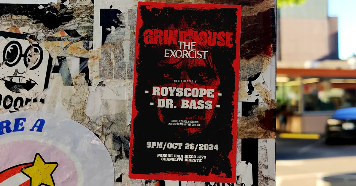
The prototype was materialized in graphic proposals adapted to the required formats, presented through mockups that took care of margins, visual hierarchy, writing and spelling.
Final validations involved minor adjustments to the position of DJ’s and sponsor logos. The main graphics remained faithful to the initial concept, ensuring a consistent and professional execution of the promotional material.