Date:
November 20, 2019
Research and Discovery
Project objective:
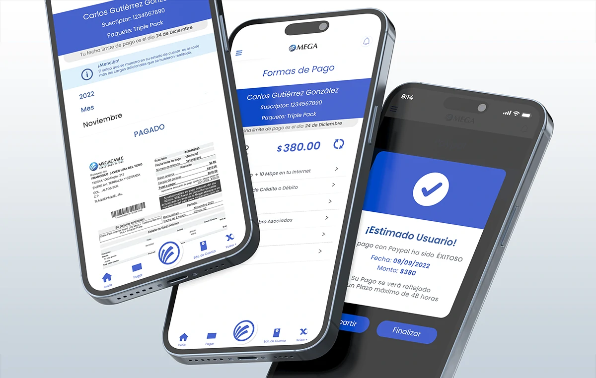
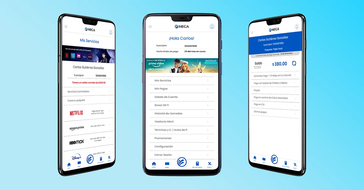
Design and launch a new mobile app for Android and iOS with a focus on ease of payment by users. The main objective was to enable direct in-app payments via credit card, debit card and PayPal, as well as integrate barcode payment methods at collection centers and merchant partners. The app also had to show contracted services, allow for new services, integrate cell phone information (if available), offer technical support, and provide quick access to contract, billing and customer service information.
Being an external company, the challenge was to coordinate with Mega’s internal systems, design and marketing teams to align objectives and functionalities, through constant interdisciplinary collaboration.
Target audience:
Current and new Mega customers. Users who require technical attention, want to avoid disconnection of services due to non-payment and need immediate access to key information such as account statements, billing, call history and contracted services. The app is designed for users seeking immediacy, clarity and practical solutions from their mobile device.
Research methods used:
- Competitive analysis: Other apps in the sector were evaluated to identify best practices, especially in the user experience and payment sections.
- Strategic selection of UX patterns: Efficiency in user flows was prioritized, making decisions based on what worked sensibly for the type of needs Mega had to solve.
- Focus Group (by the client): Mega’s marketing department conducted sessions with real users to validate key needs. The results coincided with the need to offer quick and clear access to service information and payment options.
Key findings:
- Main problem: Navigation needed to be simple, intuitive and useful. The initial challenge was to transform an existing web portal into an efficient mobile experience. We started from forms and structures of the current portal to build wireframes and flowcharts.
- Opportunity Spotlight: The redesign focused on the payment system significantly improved collection via the app.
- Key Insight: The user base increasingly relies on digital platforms to make payments, which reinforced the need to build a reliable experience.
Architecture & Strategy
General Architecture
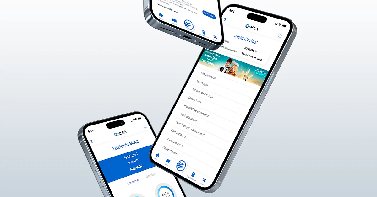
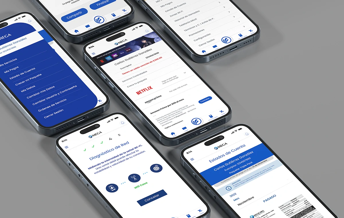
The application was structured following an architecture based on independent modules (navigation stack by areas), which allowed scaling functionalities without breaking the overall experience. Reusable components were integrated in React Native to improve maintenance and development times. The navigation was designed in a hierarchical and tabular way, allowing direct access to key functions such as payments, contracted services, promotions and support.
Robust and User-Friendly Flows
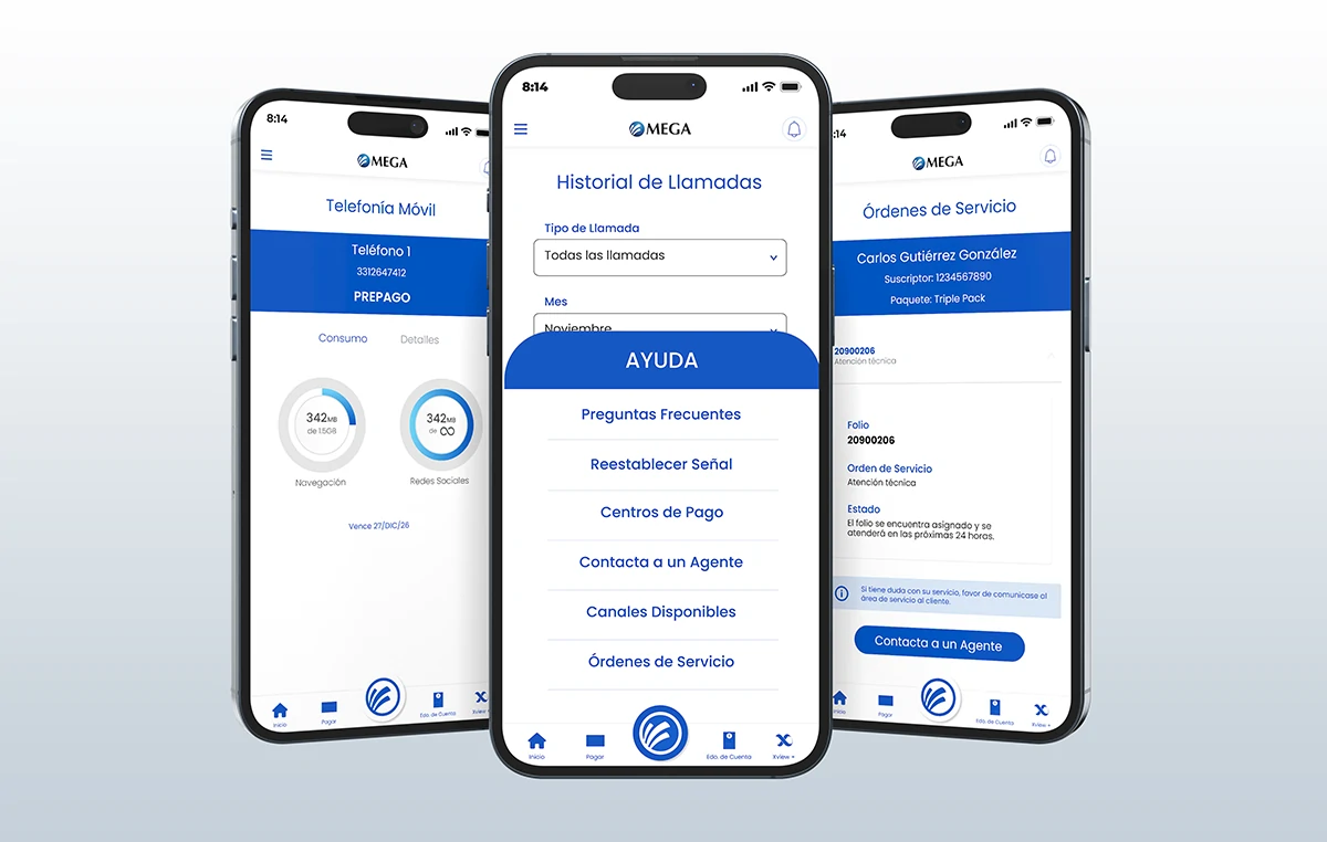
Complete navigation flows were traced from the user’s logic, taking care of critical points such as login, service contracting, payments, adjustments, promotions and customer service. Each flow was documented and validated in collaboration with stakeholders. The Help Center was one of the most complex developments: technical diagnostics, network, AI for FAQs and an online agent were integrated, facilitating user self-management.
Collaboration and Adaptation
The design respected the brand guidelines in the transition from Megacable to Mega, and adapted to the new visual requirements of the design team. Although marketing only partially covered certain views, its graphic guidelines were reused to close all the remaining flows. The result was a unified, fluid and visually coherent experience.
Comprehensive redesign
An optimized mobile experience that revolutionized.
This project marked a before and after for Mega’s app. Not only was it visually redesigned under a minimalist approach, but complete, solid and functional flows were designed and developed that positioned the application as the company’s main payment channel. At the same time, a robust Help Center was created with technical diagnostics, online agent and artificial intelligence to solve doubts, drastically improving the user experience and reducing the operational burden. All this was possible thanks to a collaborative work between design, development and infrastructure areas, respecting brand guidelines and security standards.
Visual Design & Prototyping
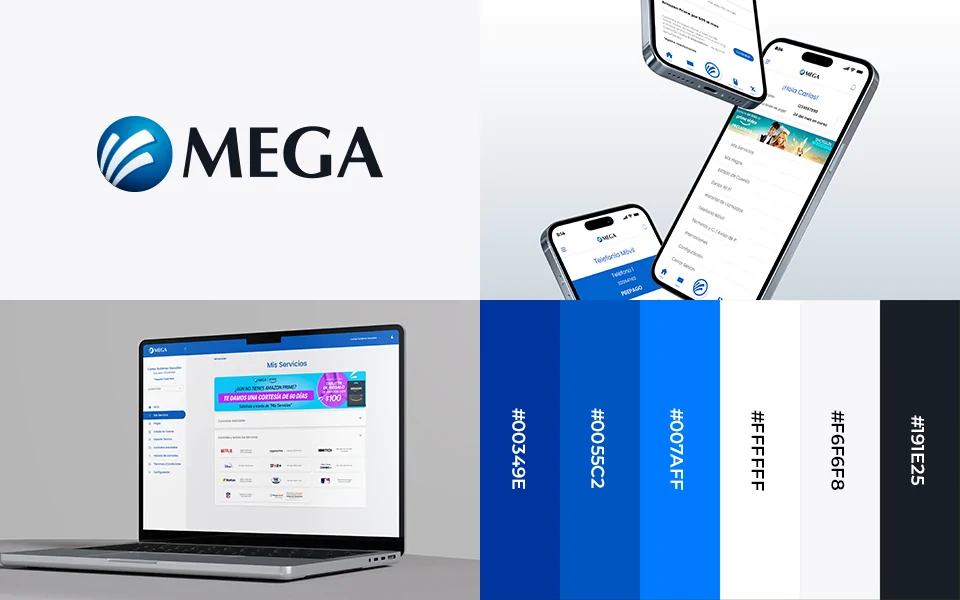
Color palette:
We started from the existing corporate identity guide, using corporate blue, black and white as a base. Red and yellow were added to these to highlight notifications within the app, always respecting the visual guidelines of the brand.
Typography:
The brand did not have a defined typography, so it was proposed to use Poppins in its 400 and 800 versions. This font was chosen for its modern aesthetics, excellent legibility and versatility in mobile interfaces.
Visual style:
A minimalist, clean and orderly style was defined, with emphasis on functionality. We chose a predominant white background and the use of cards to distribute the information in a clear and hierarchical way.
During development there were two main versions of the app. The first one was completely designed by Here4Design. Subsequently, the marketing and design department intervened with a visual proposal focused on the My Services, Home and Promotions sections. Although they did not complete all the flows, their contribution established a solid base of graphic style, which was expanded and completed by me following the navigation logic of the whole application.
We were also entrusted to manage the brand transition from Megacable to Mega, applying the new logo in all views, respecting the identity manual.
Main UI components
The app was developed in React Native, so we reused components already available within the framework, adapting their styles to the visual identity of the project.
– Buttons and Inputs:
- Full-width inputs were defined to avoid compressed elements and double columns were avoided.
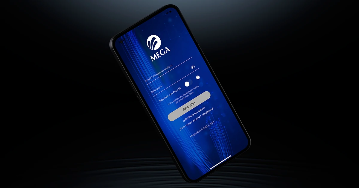
- For general forms, box type fields were used; in screens such as Login, Retrieve password or Register, inputs with bottom border were applied for a cleaner look.
– Cards and Listings:
- Specific components were developed to display contracts, telephones, action menus, lists and sliders.
– Iconography:
- Icons from the Font Awesome library were used, carefully selected according to their functionality.
– Confirmations:
- Instead of traditional buttons, a swipe system was implemented to confirm actions, which provides greater security and reduces touch errors.
Interactive prototype
The prototype was developed in Adobe XD, leveraging an existing library based on React Native. Interactions between screens were mapped and a functional link was shared with the Megacable team for internal testing.
Adjustments after testing and validation
- Services to be contracted:
This module presented several challenges. It was necessary to standardize how information was entered and organized from the administrative system so that the lists and their contents were displayed correctly and uniformly in the app.
- Help Center:
This was one of the most iterated sections. Features such as Online Agent, Technical Diagnostics, Network Diagnostics and AI integration in FAQs were developed.
Result and Value Delivered
Before vs. after
Version 1:
My first design proposal encompassed the entire flow and functional scope of the app. Although it was important to map out the complete path, visually it was very basic: heavy blue blocks were predominant and no cards were used. The interface was clunky and lacked visual hierarchy.
Version 2:
It was the result of joint work with the marketing and design department. The introduction of cards made it possible to better highlight content and facilitate key actions. The style was refined towards a minimalist approach, reducing the excessive use of color and eliminating unnecessary dividers. The final design prioritizes visual cleanliness and user experience.
 Before
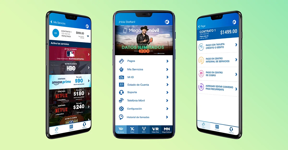 After
AfterBusiness and user impact
- Collection:
The app became the main payment channel for Mega, surpassing even the Online Services web platform. This had a direct impact on the company’s revenues.
- Improved user experience:
The payment flow was optimized to be clear, fast and easy to use. The option of direct debit payments was included and the possibility of paying for annual services in a single payment was enabled, which was well received by users.
- Higher conversion:
Thanks to the accessible and fluid design, new subscriptions for additional services were captured from the app.
- Efficient resource management:
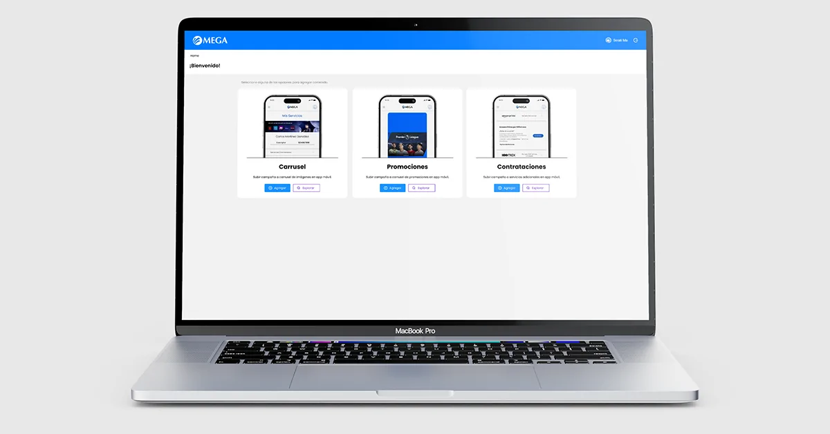
The components developed for promotional sliders, along with a parallel administrative platform, allowed Mega to segment campaigns by branch, optimizing promotional management.
- Error reduction:
Good cybersecurity practices were implemented to protect digital transfers and mitigate fraud risks.
- User perception:
Despite having an average rating of 3.0 in digital stores, most negative reviews are related to the service provided by the company, not the performance of the app itself.
Next Steps / Recommendations
- Strengthen the Help Center with more robust and proactive solutions.
- Improve the customer service experience, incorporating more intuitive and effective tools to solve common problems from the app.
Extra step: Behind the scenes
To make all of the above possible, intensive work was done on the backend, in collaboration with Mega’s infrastructure team. Multiple internal services were integrated through existing APIs and all messages programmed for each section (My Services, Payments, Account Status, Mobile Telephony) were validated, ensuring accurate and reliable responses.
A parallel administrative platform was also developed to feed and manage the promotional sliders within the app, allowing campaigns to be segmented by region or branch. This system was key to automate and streamline visual communication in the application.