Date:
September 14, 2018
Empathy and Definition
Understanding the essence to chart the course
Fortum del Bajío was looking to establish its presence in the market through a website, but its most urgent need was to achieve a professional presentation for its construction mixes: joint sealants, floor tile adhesives, tile adhesives and stucco. The priority was to design a 20 and 40 kg bag that would be multipurpose, easily distinguish the type of mix contained, and meet the technical requirements for printing, avoiding filing errors that would compromise production.
Through a benchmark analysis, common patterns were identified in the design of bags for this type of product. Both direct competition and international visual references were studied to define a distinctive line. We also worked on the brand language from the root: who Fortum is, what it offers and how it should be presented visually. At the end of this stage, the challenge was defined as: to create a functional packaging system, aesthetically differentiated and aligned both with the technical requirements of the printing supplier (GURPA) and with the incipient identity of the company.
Identity and packaging
Corporate design & functional packaging
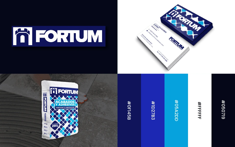
We developed Fortum del Bajío’s visual identity from the ground up, creating a graphic system that reflects solidity and professionalism. The main challenge was to design multipurpose bags for different construction mixes, combining functionality, clarity and aesthetics. We applied a mosaic texture as a visual axis to achieve a distinctive, adaptable and coherent image throughout the brand system.
Ideation and Prototyping
Shaping ideas and creating tangible solutions
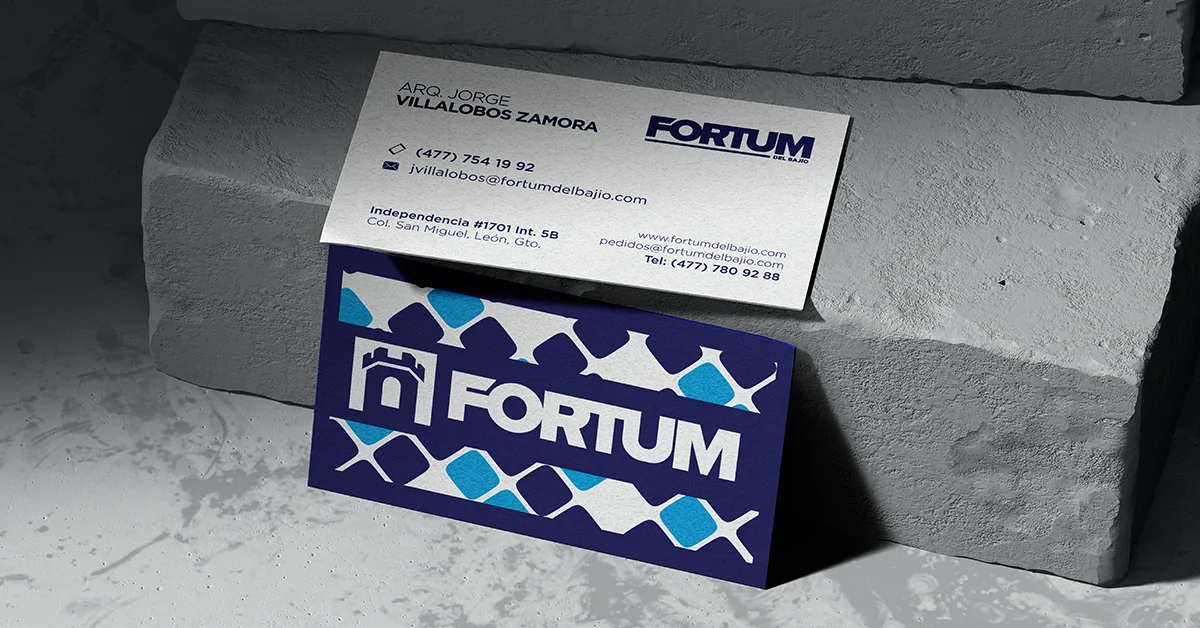
The creative process began with brainstorming sessions and visual benchmarking, which led to the creation of a graphic system inspired by mosaic-like textures. This texture was proposed as part of a transversal graphic line for the brand, and was also used on the website and business cards. The design was developed within a specific visual identity manual for this packaging system.
Two visual approaches were explored: a minimalist option in navy blue and white, and a more artistic proposal with mosaics in navy blue, white and sky blue. The latter was chosen for its ability to communicate movement, creativity and functionality within the context of the product.
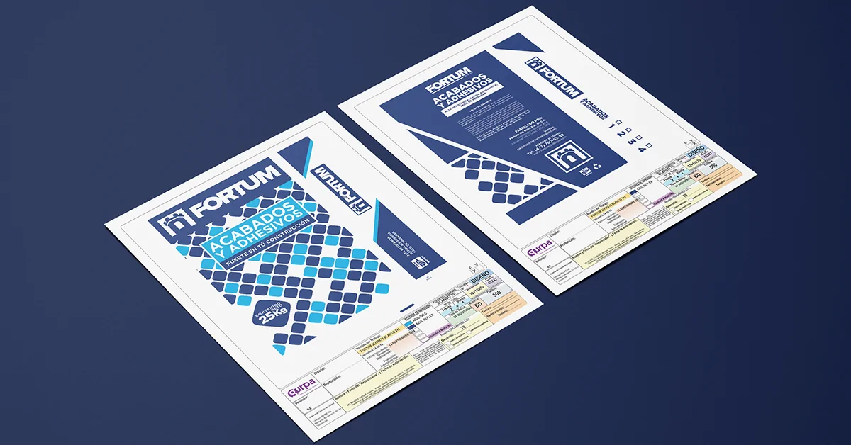
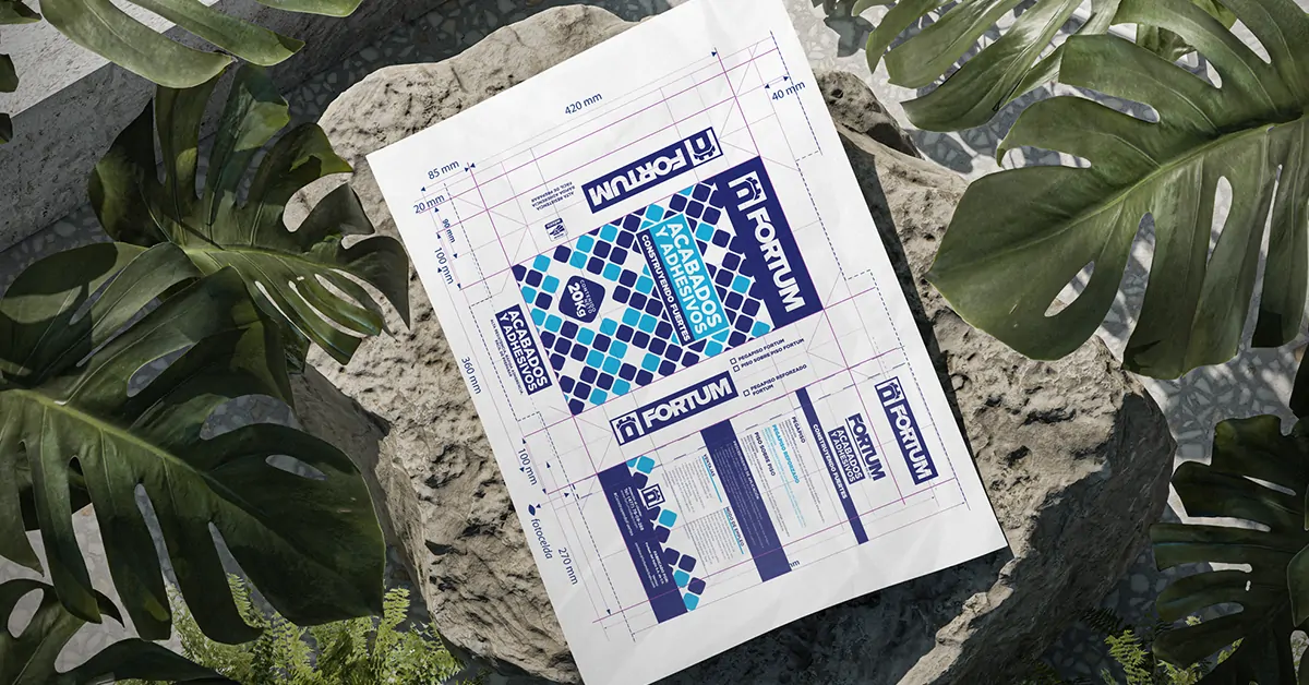
Prototyping was performed directly on the technical printing templates for 40 kg bags, respecting margins, proportions and visual hierarchies. Once the large design was validated, it was adapted to the 25 kg version, ensuring visual coherence between both sizes. Physical mock-ups were printed in docucolor, which were manually assembled to validate proportions and aesthetics, and photographs were sent to the client.
In the validation stage, two key adjustments were made: numerical identifiers and checkboxes were added to mark which mix each bag contained; and technical and usage information for each type of mix was incorporated once it became available. Finally, the mosaic design was chosen for its graphic strength and differentiation within the market.