Date:
February 19, 2021
Empathy and Definition
Understanding the essence to chart the course
Initial objective:
Karmele was looking to establish its digital presence through a website with an online store. The main challenge was to create a functional e-commerce that would allow the daily sale of products in limited quantities, both in individual presentation and in boxes. It was key that orders could be scheduled at least 24 to 48 hours in advance, integrating home delivery management, with defined routes and limited number of spaces per day.
Key customer needs:
- Sell sweet and savory products by the unit or by the box.
- Display daily availability by product in a visual calendar.
- Configure home deliveries with a daily limit of spaces (7 from Monday to Friday, 5 on Saturdays).
- Delimit delivery zone by zip code, with differentiated prices according to the zone ($60 or $90).
- Accept online payments by credit card or PayPal.
- Register orders at least 24 hours in advance.
Key questions:
- What is the main purpose of the website?
To build an e-commerce for artisan bakery with daily production control, pre-orders and scheduled home deliveries. - Who is the target audience?
People between 20 and 50 years old with socioeconomic profile A/A+. Customers with a taste for artisan bakery, sourdough and high quality pastries. - What type of content should the site display?
Catalog of permanent and seasonal products, segmented by category. Daily availability details and advance purchase options. - Do you have previous branding or will it have to be developed?
The client already had a visual identity. Base files were provided but there was no manual. A template pre-selected by the client (Le Truffe) was used as a base, to which adjustments were made to integrate the graphic material and maintain coherence with their previous campaigns. - What websites do you admire or want to take as a reference?
Mainly Marisa’s site, for its visual cleanliness and intuitive shopping flow. Online experiences of Paulette and OK Pastry Shops were also analyzed. - What devices do your users use?
Most users browse from mobile, although the site was optimized for both devices. - What contact or sales platforms do you currently use?
Contact through forms within the site. Sales through WooCommerce with integrated OpenPay and PayPal gateways.
Client’s context:
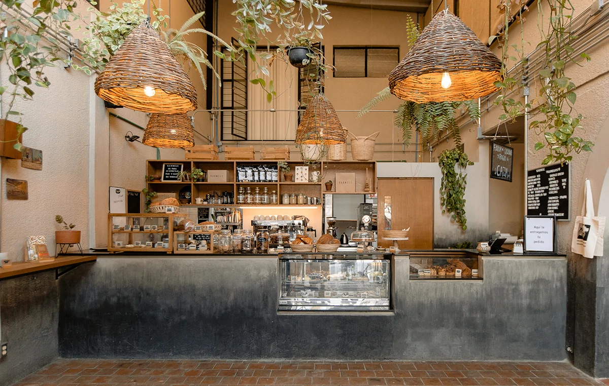
Karmele Repostería is a coffee shop and bakery located in Guadalajara, specializing in artisanal products made with sourdough. Recognized for its star product, the “Karmelitos”, it also offers muffins, pancakes, cakes and breakfast options. Its cozy atmosphere and focus on quality ingredients have made it a gourmet reference in the city.
Competitive analysis:
A functional analysis was conducted focusing on the online shopping experience, required fields, product presentation and navigation flows on sites such as Marisa, Paulette and OK Pastry Shops.
Buyer Personas identified:
Women between 25 and 35 years old, income A+, interested in gourmet products for their own consumption or gifts. Mothers 40 to 55 years old, with teenage children, income A+, buying for special occasions or family consumption.
Define – Focus requirements
Delimiting the design challenge and prioritizing functionalities
Overall project objective:
To develop a customized e-commerce that allows Karmele to sell bakery and pastry products with planned deliveries and limited production per day. A functional solution was required that contemplated availability control, delivery logistics, user registration, secure payment gateways and order scheduling.
Requirements
- Online store structure based on key categories: Karmelitos, Sweet/Salty Bakery, Cakes & Pastries.
- Calendar to control daily production and allow purchases only at least 24 hours in advance.
- Integration of delivery schedule, with limited capacity per day (7 deliveries from Monday to Friday and 5 on Saturdays).
- Filtering and control of delivery zones according to zip code (with differentiated rates per zone).
- Custom checkout to capture complete customer data and display delivery or pickup options.
- Payment methods: OpenPay (credit/debit card) and PayPal.
- Real-time validations to avoid out-of-range, unavailable or out-of-time orders.
Key elements by type of site (e-commerce):
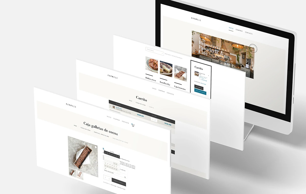
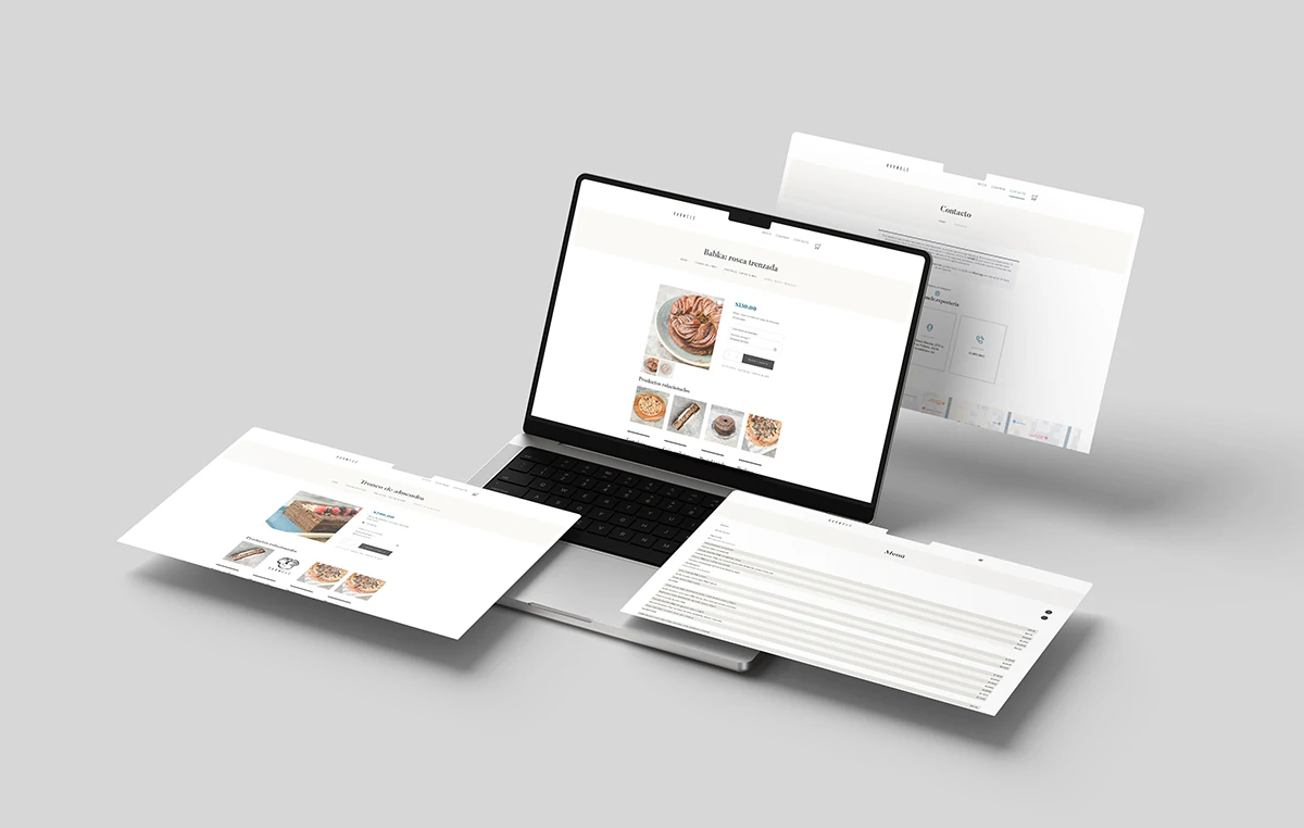
- Product catalog, with attractive images and intuitive navigation. –
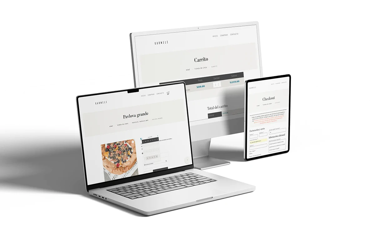
- Shopping cart with option to edit quantities and view dynamic totals.
- Personalized checkout, with validation by zip code and date selector available for delivery.
- Secure payment gateways, showing options early in the flow.
- Dynamic calendar for delivery date selection and daily inventory control.
Prioritized list of functionalities:
- Catalog by category + internal search
- Shopping cart
- Personalized checkout with delivery zone validation
- Production and delivery schedule
- Payment methods with OpenPay and PayPal
- Order confirmation with detail and automated mailing
- Online billing module
- Formulario de feedback post-compra
Technical and integration requirements:
- WooCommerce as the foundation of the e-commerce.
- Additional plugins for:
- Availability calendar by product (daily stock)
- Date selector in checkout with limit of spaces per day
- Calculation of shipping costs by zip code
- OpenPay and PayPal integration
- Sitio fully responsive (mobile-first)
- Optimization for speed and on-page SEO
- Managed hosting with support for SSL certificates and daily backups
Ideation – Concept and structure
Exploring visual and functional solutions for a user-centric experience
Creative and functional approach:
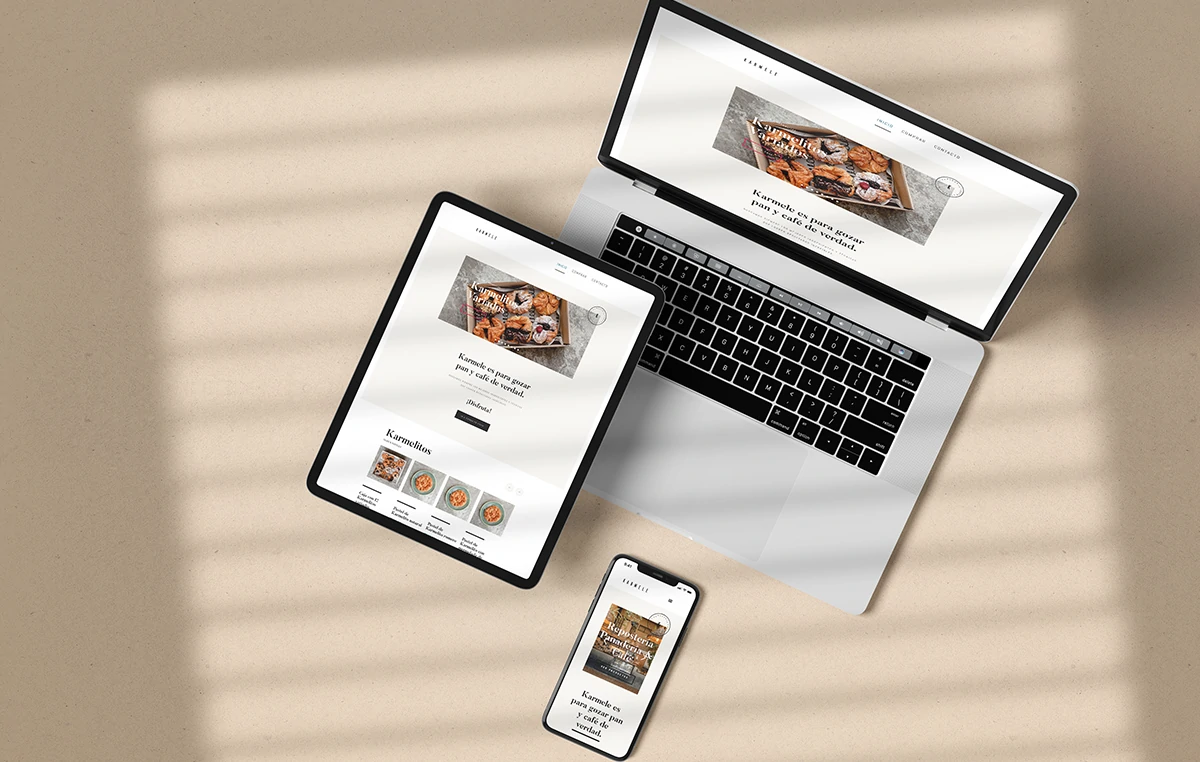
The design for Karmele focused on combining a minimalist aesthetic with a clear and intuitive structure. The “Le Truffe” template was used as a visual base for its clean and elegant style, making adjustments to reflect the brand’s personality. The visual content was built from the product photographs, the store and its campaigns in networks, providing warmth and coherence with its physical presence.
The structure of the site was designed to facilitate catalog browsing, clearly segment products and offer a simple purchasing process, especially from mobile devices.
Key decisions in the visual experience:
- The template was modified to align the color palette to a dark turquoise, replacing the original orange.
- The original typefaces (Butler Sans and Abel Sans) were retained for their clarity and elegant style.
- Category boxes were designed in the store to facilitate direct access to each type of product.
- Unnecessary decorative sections were removed from the original template, focusing the design on conversion and clarity.
Information architecture:
It was defined based on the client’s priorities:
- Clearly display categories and products from the home page.
- Visible access to billing, terms and conditions.
- Delivery schedule visible at checkout.
- Simplified contact form, focused on quick resolution of doubts.
Principa User Flow:
- Home
↓ - Online Store
↓ - List of products
↓ - Individual product (see availability and details)
↓ - Shopping cart (summary + “Checkout” button)
↓ - Customized checkout – Form with zone and date validation – Selection of payment method
↓ - Confirmation of purchase + automatic mailing
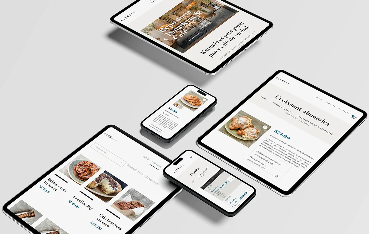
UX/UI components worked on:
- Banners with seasonal promotions
- Category boxes with filters by product
- Dynamic calendar (production and delivery)
- Checkout with customized validations
- Visual and functional order confirmation
Initial UX/UI visual proposal:
The proposal was presented directly on the real WordPress environment with WooCommerce, optimizing the base structure of the template. The complete purchase flow was prioritized, ensuring that each step was clear, fluid and reliable.
Prototyping – Shaping the final design
Building a functional, visual and adaptable experience
Objective of the prototype:
Transform the strategy into a functional and navigable site, applying the graphic and structural decisions defined in the previous phases. Priority was given to usability, adaptation to mobile devices and clarity in the purchasing process, ensuring a reliable experience for the end user.
Prototype components:
- Complete UI design, adapted to desktop and mobile.
- Integrated visual content, using the client’s photographic material and its original setting.
- Adapted checkout, with customized fields for delivery, date selection and validations by zip code.
- Production and delivery schedule, visible in the purchase flow.
- Functional interactions, such as automatic shipment calculation according to C.P. and limited stock per day.
Tools and environment:
The prototype was directly implemented in the real WordPress + WooCommerce environment, on the base template, optimizing the available resources. No prototyping was performed in Figma, as the client required a functional delivery from the first stage.
Adjustments made in the implementation:
- Removed unneeded sections of the template (such as blog, event banners, etc.).
- The billing and shipping fields in the checkout were redesigned to adapt to the internal logistics system.
- Additional modules were inserted to control daily stock and delivery spaces at least 24 hours in advance.
- The site was intensively tested on mobile devices, considering that more than 60% of purchases are made from smartphones.
Deliverables of this phase:
- Functional site in test environment (staging)
- Navigable prototype with final structure
- Operational calendar for deliveries and product availability
- Visual guide for site maintenance and content updating
- Basic customer user manual (order and product management)

Evaluate and Deliver – Validate and Publish
Fine-tuning details and ensuring a solid experience prior to launch
Final objective:
Perform comprehensive testing, optimize site performance and validate that the purchasing system complies with the defined flows. Ensure desktop and mobile experience, with a special focus on load times, clarity in the purchase process, and confidence during checkout.
Actions carried out during this phase:
- Internal usability testing:
All possible navigation and purchase flows were tested from multiple devices (desktop, tablet and mobile). The correct visualization of the delivery calendar, daily stock by product and segmentation by zip code was validated. - Site optimization:
- Image weight reduction without loss of quality.
- Minification of CSS and JS files.
- Optimization for speed with caching and compression.
- CDN configuration on the client’s server (when applicable).
- Basic on-page SEO validation (titles, alt text, hierarchical header structure).
- Testing of payment gateways (sandbox):
Simulations were performed with OpenPay and PayPal to ensure successful transactions, controlled errors and clear redirects. - Calendar and stock tests:
We tested scenarios of 24h and 48h advance purchase, verification of blockages outside the allowed range, and limitation of spaces per day. - Validation of deliveries and zones:
We verified the correct calculation of shipping costs according to zip code ($60 / $90) and its integration in the checkout. - Integration of analytics:
Google Analytics and basic events were installed to track visits, purchases and cart abandonments. - Customer training:
An administration manual was delivered with screenshots for:- Review and process orders
- Manage calendar availability
- Edit delivery zones and prices
Final deliverables:
- Site published on final hosting with active SSL certificate
- Basic user’s manual for product and order management
- Suggested monthly maintenance checklist
- Complete backup of the site before publishing
- Technical documentation of integrations and plugins used
Outstanding Results:
- +3,800 orders placed in the period
A steady flow of sales, reflecting an intuitive and reliable site. - More than 10,000 items sold
With an average of 2.6 products per order, indicating multiple purchases per visit and good cross-selling strategy. - Very high customer satisfaction
Only 0.05% of orders were refunded, demonstrating that the shopping experience meets expectations. - Monthly consistency in sales
The average monthly revenue remained stable over time, which is key to the sustainability of the business. - Logistics cost recovery
Implemented a shipping collection strategy that allowed us to cover logistics costs without sacrificing conversion. - No dependence on discounts or promotions
0% of sales involved coupons, reflecting the strength of the brand and the perception of full value in the products.
Conclusion:
Thanks to a conversion-oriented web design, clear navigation and a focus on user experience, Karmele consolidated its online store as a stable, profitable and growing platform, achieving outstanding results without resorting to aggressive promotions.